Creating a branded PowerPoint template isn’t just about aesthetics; it’s an essential step in maintaining brand consistency and engaging your audience. This comprehensive guide will walk you through the process of designing a PowerPoint template that not only looks professional but also resonates with your brand’s identity.
Understanding Brand Identity
Before embarking on the journey of template creation, it’s imperative to delve deep into the essence of your brand identity. This process involves a comprehensive understanding of various brand elements:
Brand Colors
These are not just any hues; they are the colors that define and distinguish your brand. Selecting a color palette that resonates with your brand’s ethos is crucial. Each color should be reflective of your brand’s personality, evoking the right emotional response from your audience. For instance, blue often conveys trust and dependability, while red can evoke excitement and passion.
Fonts
The fonts you choose are the voice of your brand in written form. Each font style carries a different connotation. Serif fonts, like Times New Roman, often suggest tradition and reliability, while sans-serif fonts like Arial embody modernity and simplicity. It’s not just about aesthetics; readability across various devices is also key.
Logo and Imagery
Your logo is more than just a graphic; it’s the face of your brand. Integrating your logo seamlessly into the PowerPoint template is vital for reinforcing brand identity. Alongside logos, the imagery used should align with your brand’s narrative. High-quality, relevant images should enhance the message of each slide, not overwhelm it.
Overall Message
What is the story your brand aims to tell? Your PowerPoint template should be a visual extension of this narrative. Every element, from color to font, should harmonize to convey your brand’s unique story.
Color Palette
Selecting a color palette for your PowerPoint template is a strategic decision that goes beyond personal preference. Here’s how to approach it:
- Brand Alignment: Ensure the colors chosen align with your brand’s existing color scheme. Consistency is key;
- Emotional Impact: Different colors evoke different emotions. Use color psychology to choose colors that elicit the right feelings from your audience;
- Contrast for Readability: Ensure there is sufficient contrast between the background and text for readability;
- Accessibility: Consider viewers with color vision deficiencies. Tools like color blindness simulators can help ensure your palette is accessible to all.
Typography
Typography in your PowerPoint template is not just about the aesthetic appeal; it’s about communicating your brand’s voice effectively. Consider the following:
- Brand Personality: Choose a font that reflects your brand’s personality;
- Readability: Ensure the font is easy to read, even on small or large screens;
- Consistency: Use a consistent font throughout to maintain a cohesive look.
Incorporating Logos and Imagery
When it comes to integrating logos and imagery in your PowerPoint template, remember that these elements are much more than mere aesthetic choices; they are crucial components in reinforcing your brand identity. The placement of your logo is key to achieving a balance between brand presence and content clarity. Ideally, your logo should feature prominently yet unobtrusively, perhaps in a corner or the header of each slide, ensuring it doesn’t overshadow the main content.
Alongside logo placement, the quality of images used plays a pivotal role. Opting for high-resolution images that echo your brand’s message not only adds visual appeal but also communicates professionalism and attention to detail. Furthermore, the relevance of these images cannot be overstated. Selecting visuals that directly complement and illuminate your presentation’s content can create a more cohesive and impactful narrative.
Layout and Structure: Organizing for Impact
The layout and structure of your PowerPoint template are the scaffolding upon which your content rests, and their importance in effectively delivering your message cannot be overstated. A key aspect of this is maintaining a consistent slide layout. This consistency not only lends a professional sheen to your presentation but also aids in guiding your audience’s attention through the flow of information.
In addition to consistency, the use of alignment tools and grids is instrumental in organizing content in a clean, accessible manner. These tools help in placing text, images, and other elements in a balanced layout, enhancing both aesthetics and readability.
Another critical component in your template’s layout is the effective use of whitespace. Far from being mere empty space, whitespace serves as a powerful tool in reducing clutter on your slides. It allows for the content to breathe, thus enhancing readability and ensuring that the audience’s focus remains on the key elements of each slide.
Exploring Best-in-Class PowerPoint Template Examples
To further enhance your understanding of what constitutes an exceptional PowerPoint template, it’s insightful to explore examples that exemplify best practices in design, layout, and brand integration. These templates can serve as inspiration, helping you to visualize how various elements like color, typography, and imagery can come together to create a cohesive and impactful presentation.
Creative Agency Template:
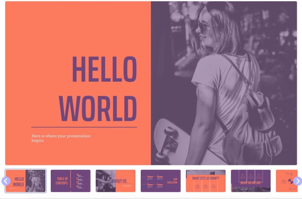
Known for its vibrant and dynamic design, this template typically incorporates bold colors and unique font choices that reflect a creative brand’s energy. The use of custom graphics and animations in these templates can be particularly striking, showcasing how these elements can bring content to life.
Educational Presentation Template:
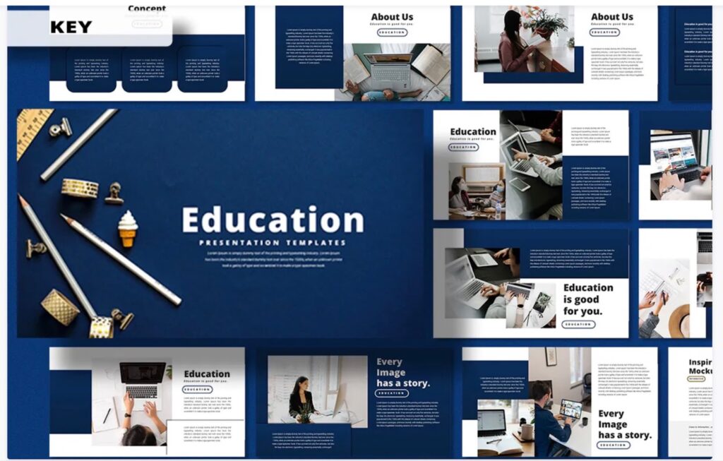
Ideal for educational settings, this type of template often uses bright, engaging colors and clear, readable fonts. The layout is usually straightforward, facilitating easy comprehension of complex information. Educational templates might include infographics and charts to aid in visual learning.
Tech Startup Template:
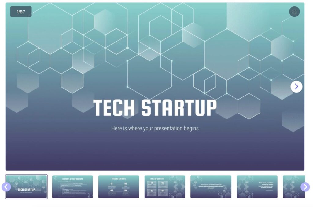
Reflecting the innovative spirit of tech startups, these templates often feature modern design elements, such as minimalist layouts with vibrant color contrasts. They might also incorporate futuristic fonts and data visualization tools, like graphs and timelines, to showcase technology trends or company growth.
Conclusion
Creating a branded PowerPoint template is an investment in your brand’s visual communication. A well-designed template not only makes your presentations look professional but also strengthens your brand identity.